
Why Responsive Web Design Matters
Responsive design is about usable tasks across screens, including navigation, Thai typography, forms and media.
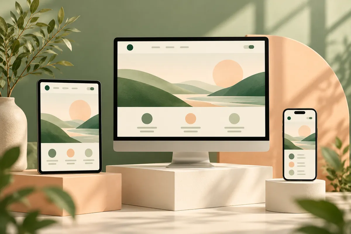
Responsive design adapts content and interaction to the space available. It is more than shrinking a desktop layout. A visitor on a phone still needs to understand the service, read details and complete the same essential action without hidden information or overlapping controls.
Start from content priority
Decide what must appear before the main action and which supporting content can follow. On a small screen, stacking text, calls to action and imagery is usually clearer than positioning them over one another. Keep the original meaning when a decorative composition changes.
Let content determine breakpoints
Use flexible layouts and introduce a breakpoint when the content no longer fits comfortably. Test between standard device widths as well as at them. Long English titles and Thai vowel marks can expose problems that a short design sample hides. Give Thai text enough line height and avoid forced breaks that split ideas awkwardly.
Test interactions, not only screenshots
Check menu opening and closing, keyboard focus, input errors and the on-screen keyboard. Ensure touch controls are comfortably separated. A fixed banner can obscure the submit button when a phone keyboard opens. A screenshot taken before typing will not reveal that failure.
Keep images and tables usable
Preserve image proportions and reserve space to reduce layout shifts. Use responsive image sizes instead of sending the largest file everywhere. Allow a genuinely wide comparison table to scroll in a labelled region rather than forcing the entire page beyond the viewport.
Build a repeatable review
Test narrow phones, a tablet and large screens in both languages. Complete a real task on each layout, including an error and recovery. Also test reduced-motion settings. Use the website quality checklist as a starting point; responsive quality is demonstrated through successful tasks, not a device icon in a proposal.
Sources & further reading
Examples and decision frameworks are planning guidance, not guaranteed outcomes. Check current provider requirements before implementation.
Related articles
View all →
Website Development
What Makes a Good Business Website?
A practical website review covering audience fit, proof, accessibility, contact journeys and maintainable content.
2 min read
Website Development
Website vs Web Application: What's the Difference?
Decide whether your project needs content pages, authenticated workflows or a combination of both.
2 min read
Website Development
How Much Does a Business Website Cost?
Compare website proposals by scope, content, functionality, migration and ongoing responsibilities.
2 min read